
Helping Chase Bank consumers avoid over spending
Overspending is a problem many Americans face. I worked on a solution to help users to stay within their budget and save more money.
Client:
Team:
Timeline:
Tools:
Chase, JP Morgan
Independent work with the help of a mentor
6 weeks
Sketch, InVision, Maze, Illustrator, Photoshop
This was 120 hours, a 6-week project as part of Design Lab where I worked with a hypothetical project.

User Research
Initial hypothesis: Financial management is difficult and users struggle because they are not diligently tracking their expenses.
Research findings: Users are comfortable using an app to track their expenses but don’t want to make a constant effort. Some users didn’t even understand that overspending is a serious problem.
My solution: Create a feature within the app to turn financial management into a habit by adding a monthly spending limit.
Key Takeaways From The User Interviews
-
People overspend; paying with a credit card makes users feel less secure about spending money
-
Users don't need to make a constant effort; the app does everything from tracking user's expenses to creating a nice pie-chart, and she/he just needs to check the app once in a while
Persona
Through my research, I discovered two different personas, Mike and Steven. Mike is less knowledgeable about personal finance and is less careful with his money. The other persona, Steven, is diligent and wants to know more about his personal finances.


Simulation and Test
I simulated some situations to understand what would make users continue using the monthly spending limit feature and what would make them quit using it.
To encourage users continue using the feature, I added a reminder that send users positive messages whenever they are on the right track, notifications of the amounts they have spent, and warnings whenever they spend at a pace that would reach their limit sooner than they had planned.

Prototype
Visual Design & Prototype

Plans

First draft
After first usability test, I changed it no scroll down because the bottom of the screen easily missed.

Second draft
The sliders differentiated in color and the shapes. Also, the method of notifications slide up. All elements are on one screen to prevent users from scrolling down.

Hi-Fidelity Design & Prototype
From the simulation I came up with a solution that will help users stay within their budget and requires minimal effort. Within the Chase bank app, I added a feature where users set a goal for what percentage of their income they would spend during that period, and users will receive alert when their spendings approach or exceed that target.

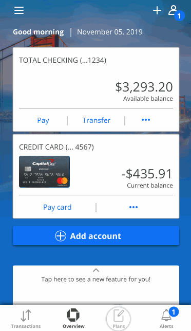
Tapping the plans icon takes you to the Plans page

To set spending limit, users slide the blue slider up and down, what percentage of their income will they plan to use.

Instruction shows up for first-time users.

When users turn on the spending limit alert toggle, the orange slider shows up to set up an alert.

A pop-up window slides up when users set up the method of notification.

Finding The Right Layout
Conducting user testings gave me feedback to find the right page layout. The overall design is now more organized and intuitive for the user.
First draft
The page was crammed with lots of information' and a weak informational hierarchy.
Second draft
To make it more clear to the user, I differentiate the slider by changing the color and shape.

Final
To avoid distractions, I removed the previous months, so the user could focus on the current month.
Getting Notifications
Reminders encourage users continue using the feature. Users receive positive messages whenever they are on the right track, notifications of the amounts they have spent, and warnings whenever they spend at a pace that would reach their limit sooner than they had planned.


